03 · Flyve LLC
Flyve: Running for Everyone
A community platform connecting runners of every experience level across New York City.
- Sector
- Social Fitness / Community
- Role
- UI/UX Designer
- Type
- Research, UX design & high-fidelity UI
- Year
- 2023
- Tools
- Figma
Overview
Flyve's founders had a running community already forming offline, on trails and in group chats, but no shared platform to bring it together. My job was to research that community and design the app that could hold it.
Jump to outcome ↓The Problem
Beginner runners found existing running clubs intimidating, and experienced runners training for a race wanted a real running partner, not just a tracking app. The platform had to work for both: a low-pressure way in for newcomers, and a way to actually find someone to train with for people already keeping a schedule.
Beginner runners are intimidated by running clubs and communities. People just want a buddy to run with.
Approach
- 01
Ran a competitive teardown of TennisPal, BuddyUp, and Strava before designing anything, to see which parts of "social fitness app" were already solved and which were the actual gap.
- 02
Mapped the full product as a flowchart first (home, calendar, community, messenger, profile) so matching, events, and messaging shared one navigation model instead of three bolted-on features.
- 03
Took the onboarding, matching, and events flows to high fidelity in Figma, on a design system built around Halyard Micro and Inter.
What Strava and running clubs don't do
Before designing anything, I audited the apps runners were already using. TennisPal let people find courts but wasn't built for pace or schedule matching. BuddyUp's flow felt more like a dating app than a running one. Strava synced everyone's data but stayed user-based, not community-based, so it never actually got two runners into the same park at the same time.
TennisPal: court-finding works, but sliders and matching are an afterthought.
BuddyUp: quick login, syncs with Strava, but the flow reads as dating, not running.
Strava: great feedback loop per user, but nothing pushes two runners toward the same run.
What runners actually told us
User research turned up a consistent split: beginners were put off by the idea of a "running club," while more serious runners wanted a specific kind of help, someone at their pace, for a specific goal like a marathon.
It's difficult to schedule a run even with runners you already know.
People want running buddies to run with, not just a tracking app.
Running is a good way to meet new people, if the app doesn't feel like a chore.
A chat option that hides stats keeps the app from feeling like a numbers contest.
Runners want to filter by pace, since a mismatched pace ruins a run fast.
People training for marathons specifically want a partner, not just company.
Matching, without the dating-app feel
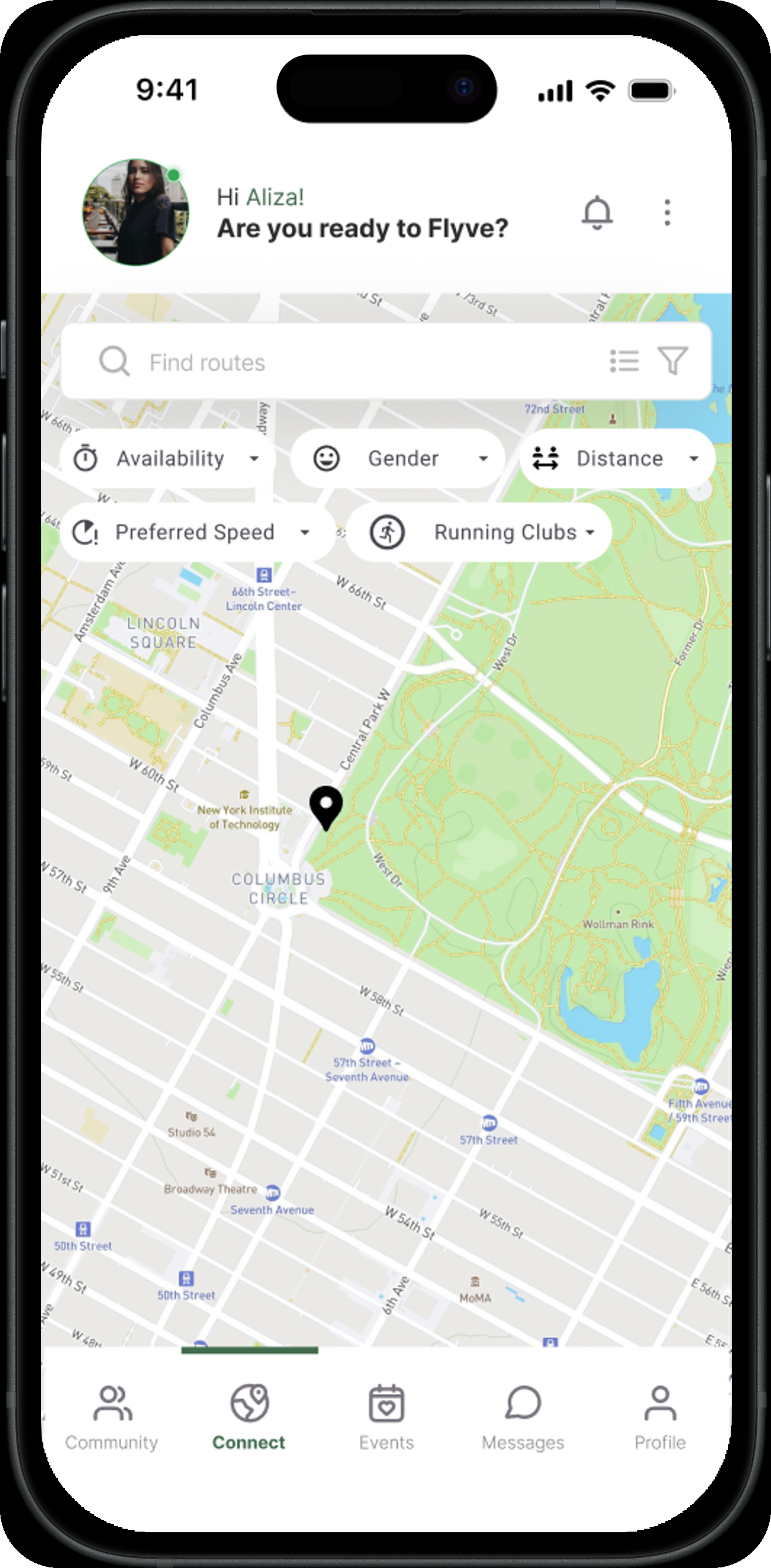
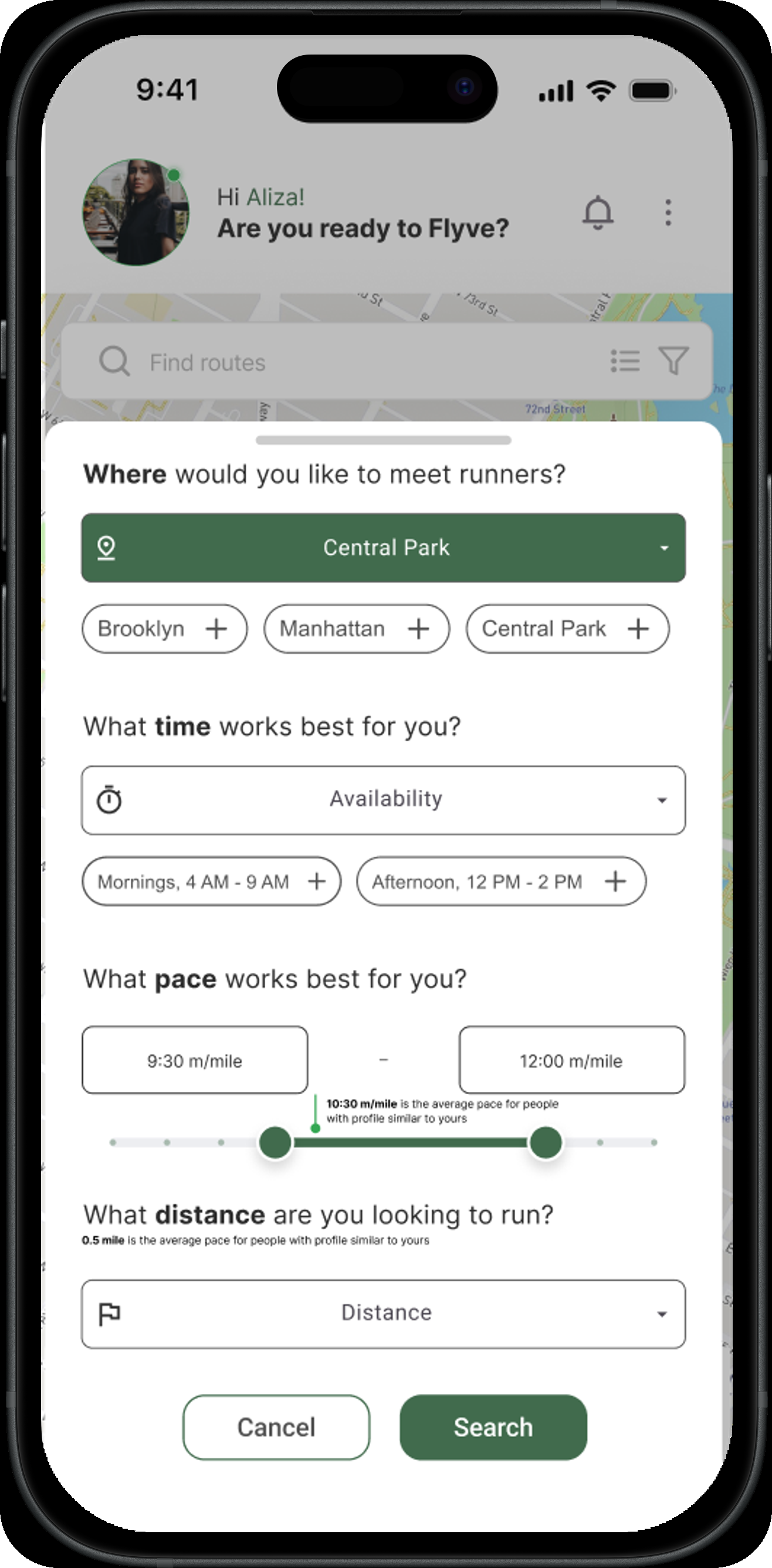
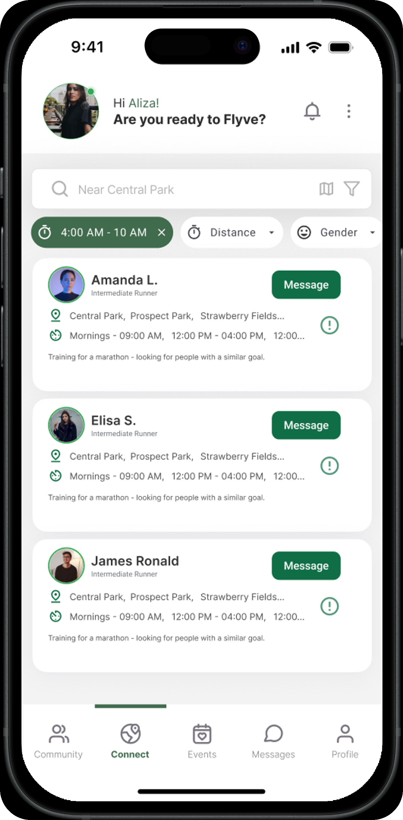
The core loop is a filtered search: pick a location, a time window, a pace range, and a distance, and Flyve returns runners nearby who fit. Results show exactly why someone's a match, their usual parks, their availability, what they're training for, so a message isn't a cold open.
An onboarding that asks what actually matters
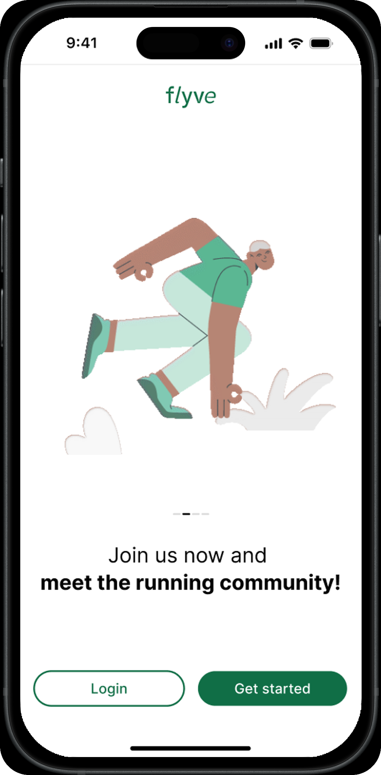
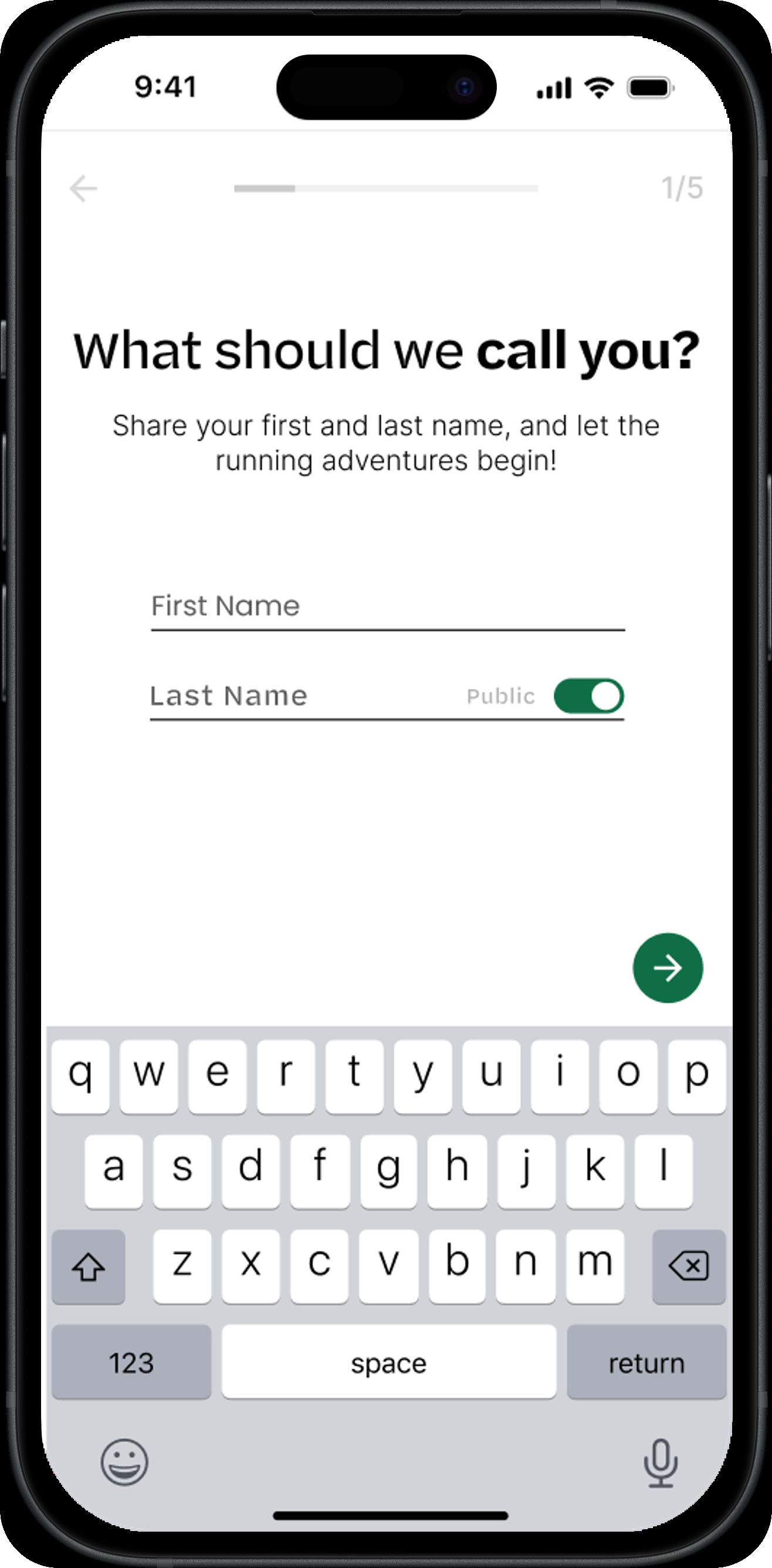
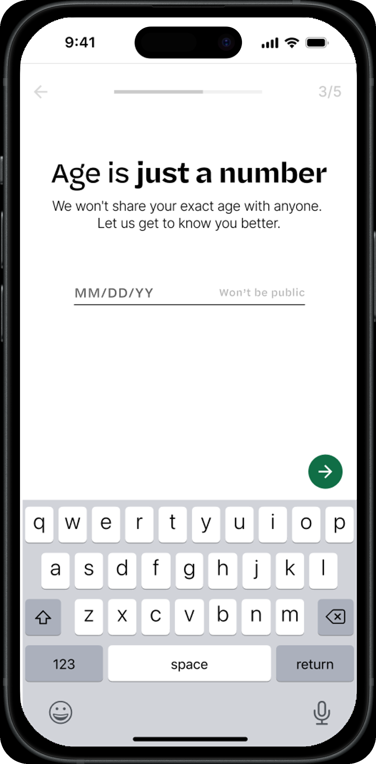
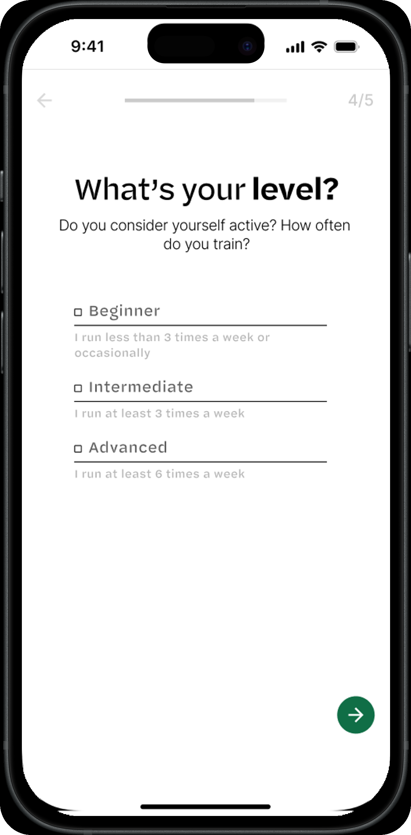
Onboarding collects only what changes the matching: name, age range (kept private by default), and a self-rated level from beginner to advanced. No stats to fill in before you've even gone for a run.
Events sit next to matching, not behind a separate app
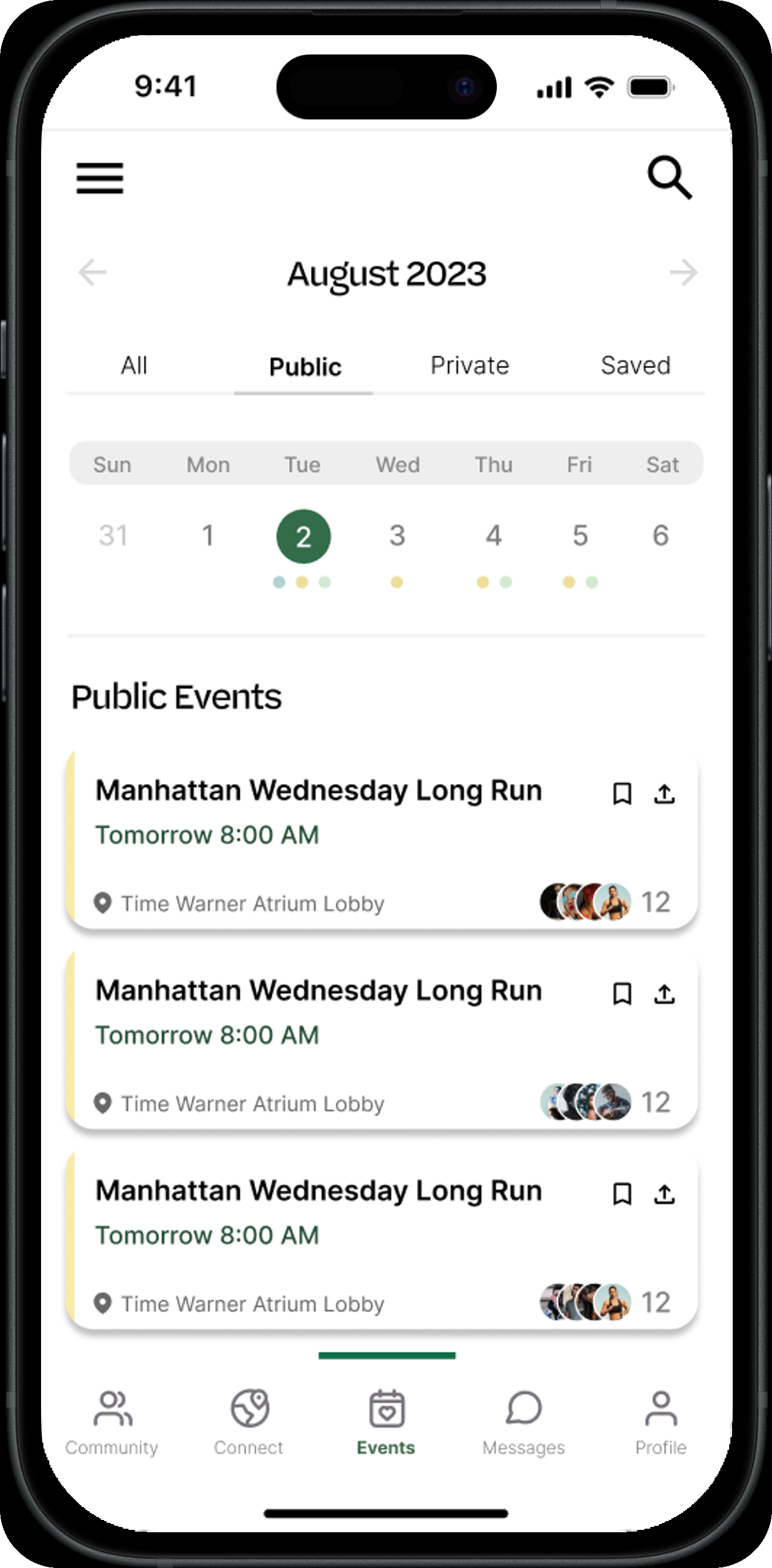
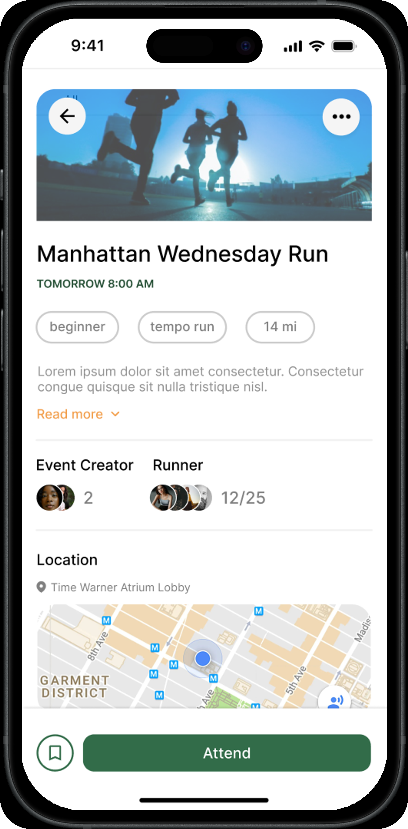
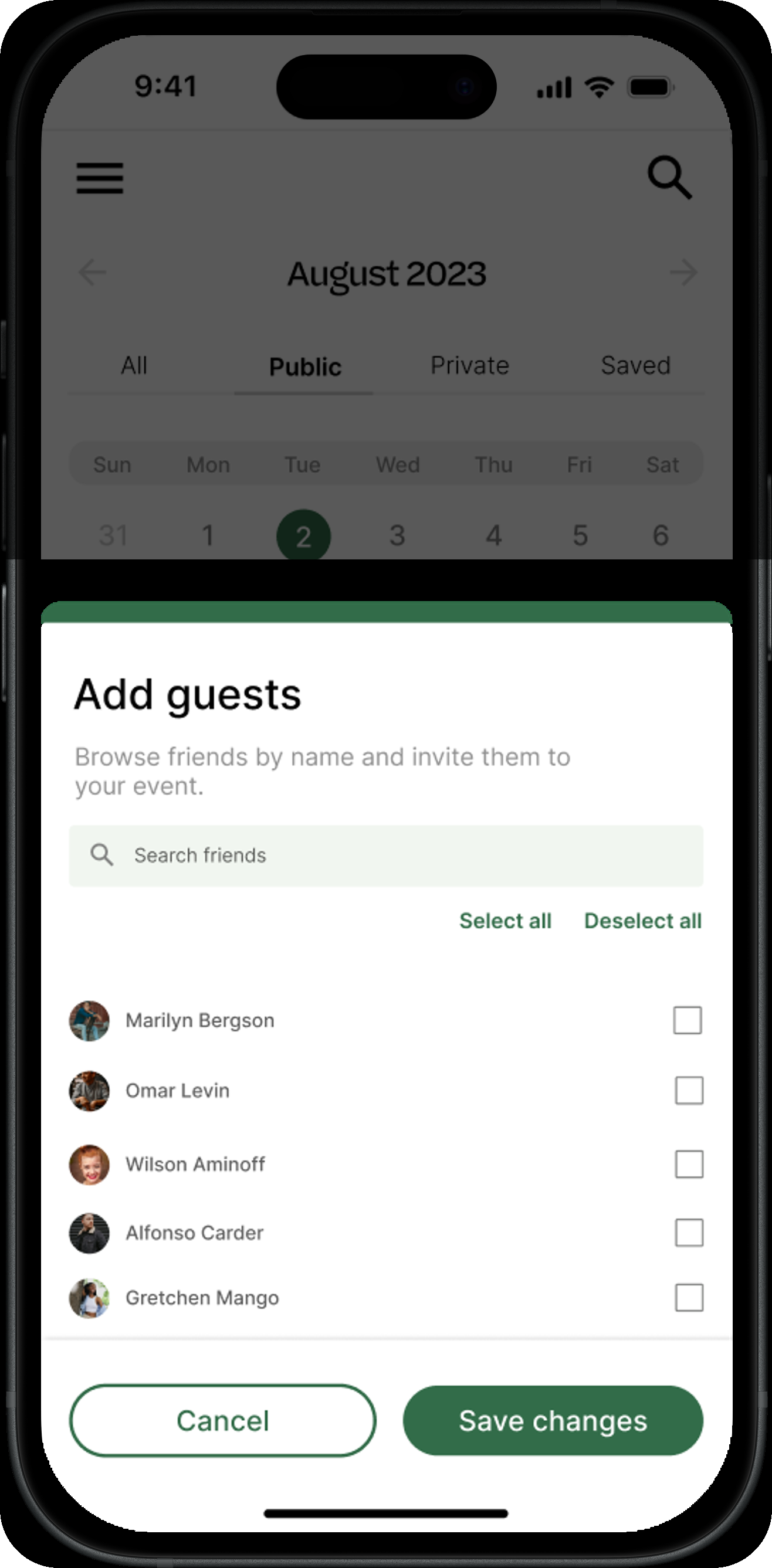
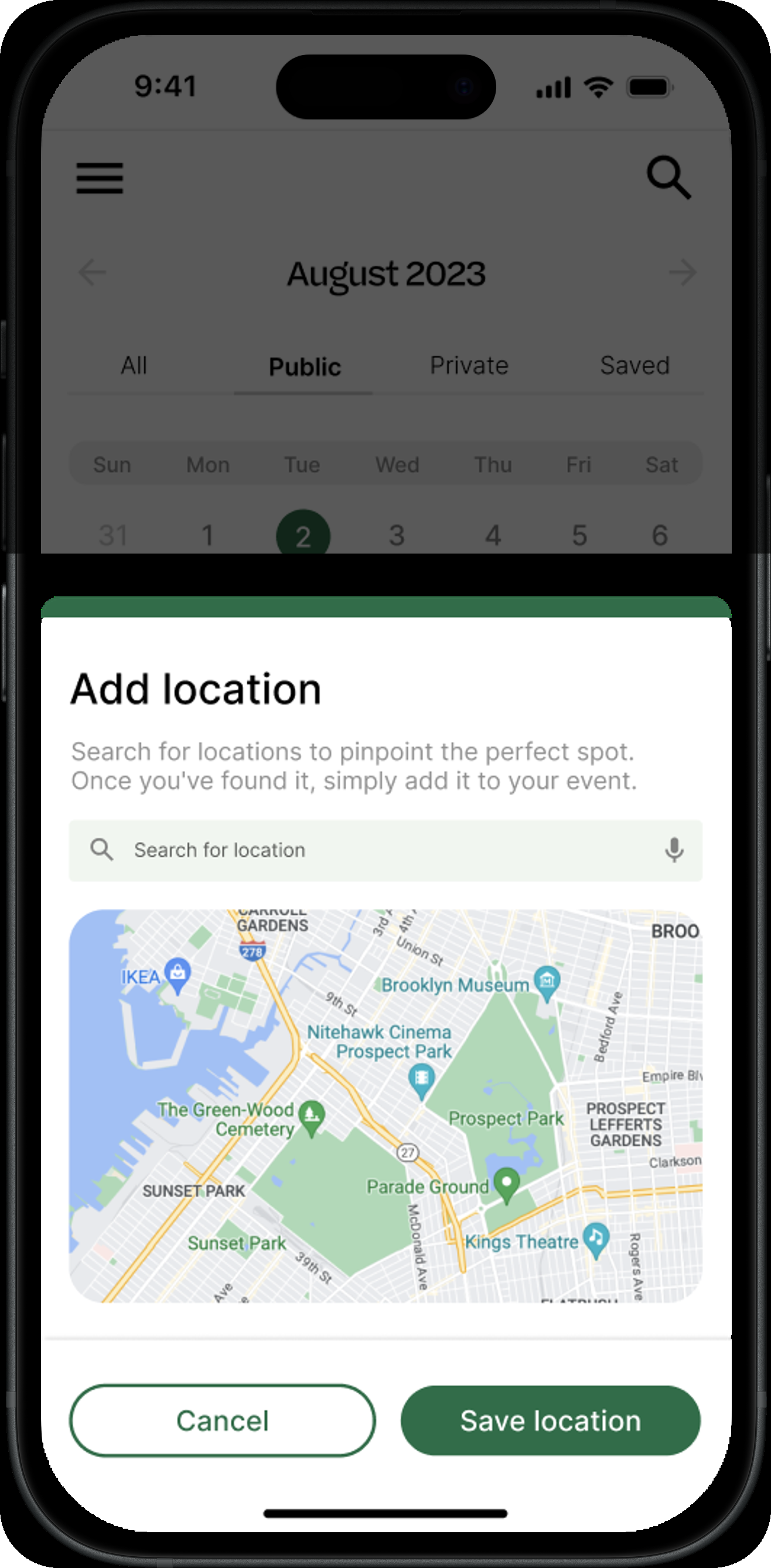
Group runs needed the same home as one-on-one matching, so Events is a full calendar (public, private, and saved runs), not a bolted-on list. Opening a run shows the route, who's attending, and one clear action; creating one reuses the same guest- and location-picker patterns as the rest of the app.
Outcome
A complete, high-fidelity prototype covering onboarding, runner-matching, and events, handed off with a documented design system so the founders could brief development directly from Figma.
More Work
04
Max: Gaming Community Platform
05
Maternal Health Supplement Research
06
National Family Health Brand Testing
07
Climate Finance Accelerator Launch
08
Impetus Advisory Group Website
09
What She Carried
10
Biofutures: Design Thinking for the Planet and Beyond
11
ToeTapText
01
MMBL Dost App Redesign
02
HealthOps Reporting Dashboard