01 · MMBL (Mobilink Microfinance Bank) × Ideate Innovation
MMBL Dost App Redesign
A ground-up redesign of MMBL's Dost app, grounded in field research with Pakistan's least-served customers.
- Sector
- Fintech / Financial Inclusion
- Role
- UI/UX Design Lead & Researcher
- Type
- End-to-end product design
- Year
- 2024–2025
- Tools
- Figma · Maze
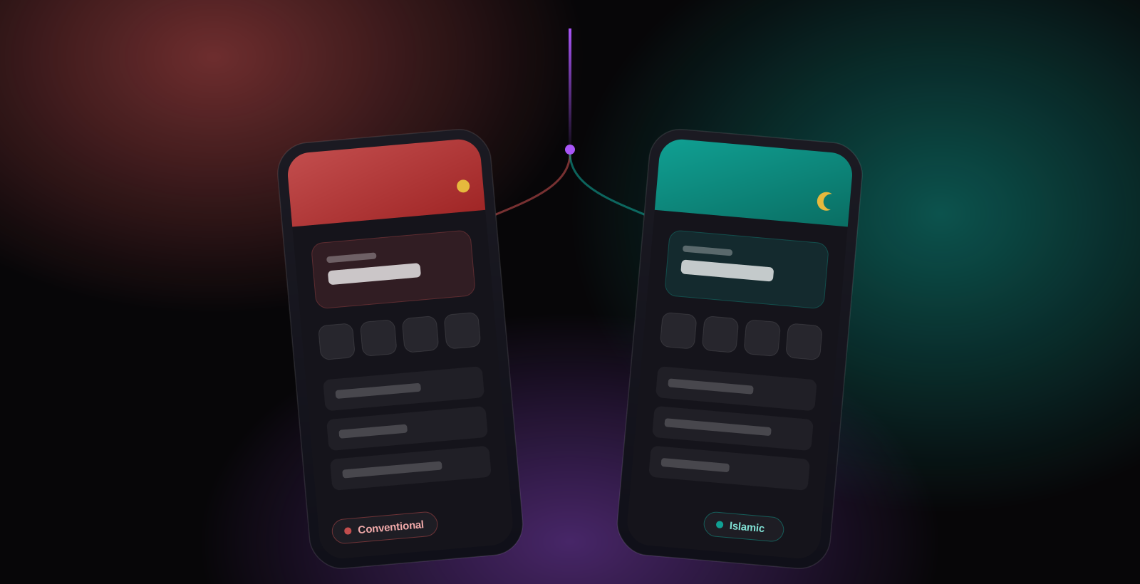 Fig. 01 · Fintech / Financial Inclusion
Overview
Mobilink Microfinance is one of Pakistan's largest digital banks, but a wave of negative feedback was pointing at something a new feature couldn't fix. People didn't trust the app, and a large part of the user base couldn't really use it. Many of these customers have low digital literacy, low vision, or low numeracy, and some are using a banking app for the first time.
Jump to outcome ↓The Problem
MMBL's brief asked for a redesign, but the negative feedback pointed somewhere deeper: the app needed to be clear, usable, and trustworthy for the people who find banking hardest, at the exact moments where money was on the line.
The brief needed a redesign. The real job was to make people trust it and use it.
Approach
- 1
Start in the field, not in Figma: a heuristic audit, stakeholder interviews, and 20 hours with customers surfaced the real problems, then rebuild the conventional app around trust and access.
- 2
Then extend the same tested foundation into a full Sharia-compliant experience, without forking the product.
Part One: rebuilding the core app around trust and access
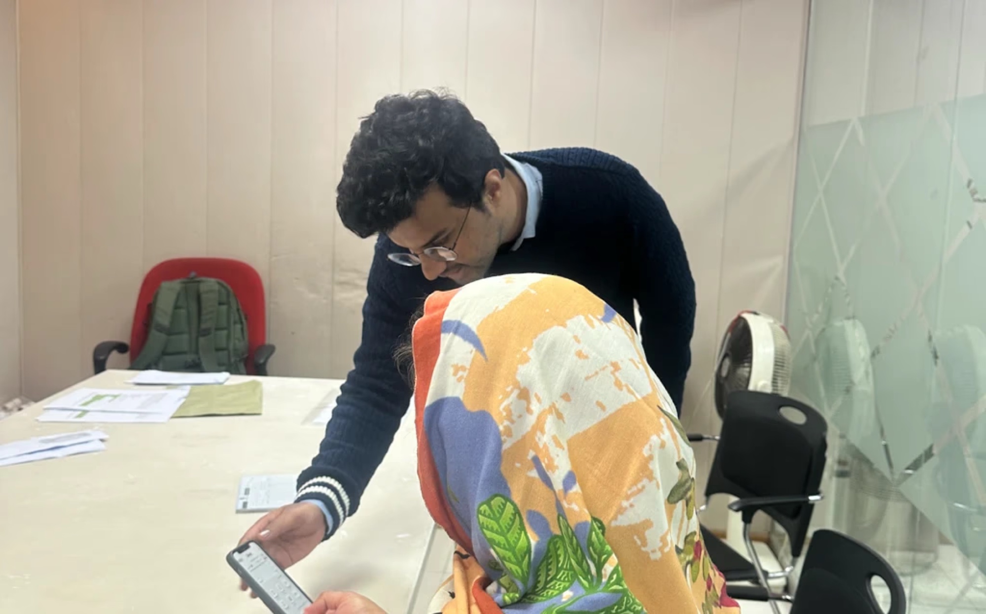
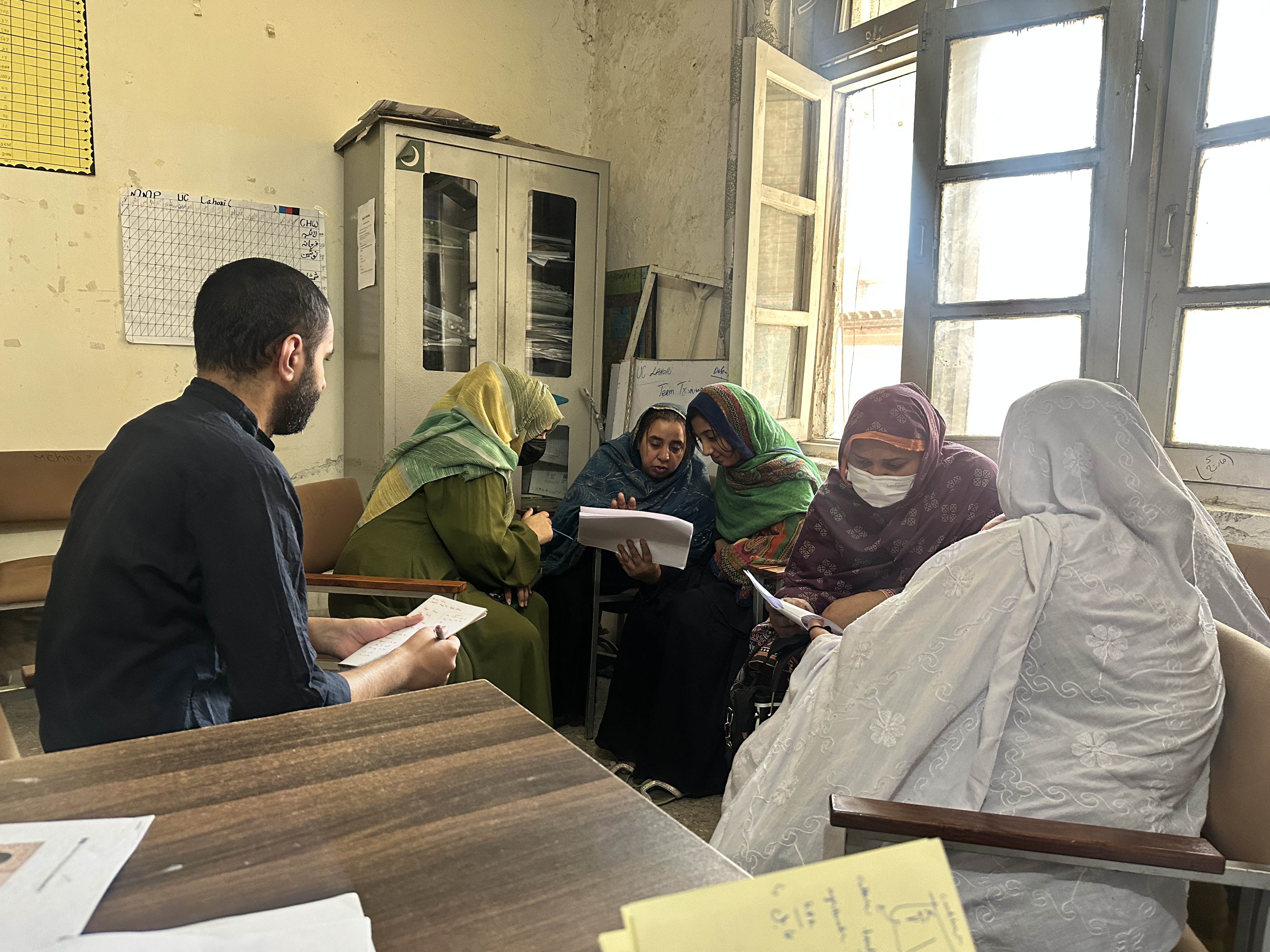
To start, we ran an internal heuristic audit, interviewed stakeholders, and spent 20 hours testing the app in the field with 15 customers. The same three problems came up again and again.
App frustrations
people valued high transfer limits and loans, but hit constant friction in onboarding and confusing content.
Trust & technical issues
slow OTPs, crashes, and unclear errors eroded trust and pushed users toward competitor apps.
Demand for new tools
strong appetite for digitised loan management, repayment calculators, installment reminders, and transparent fees.
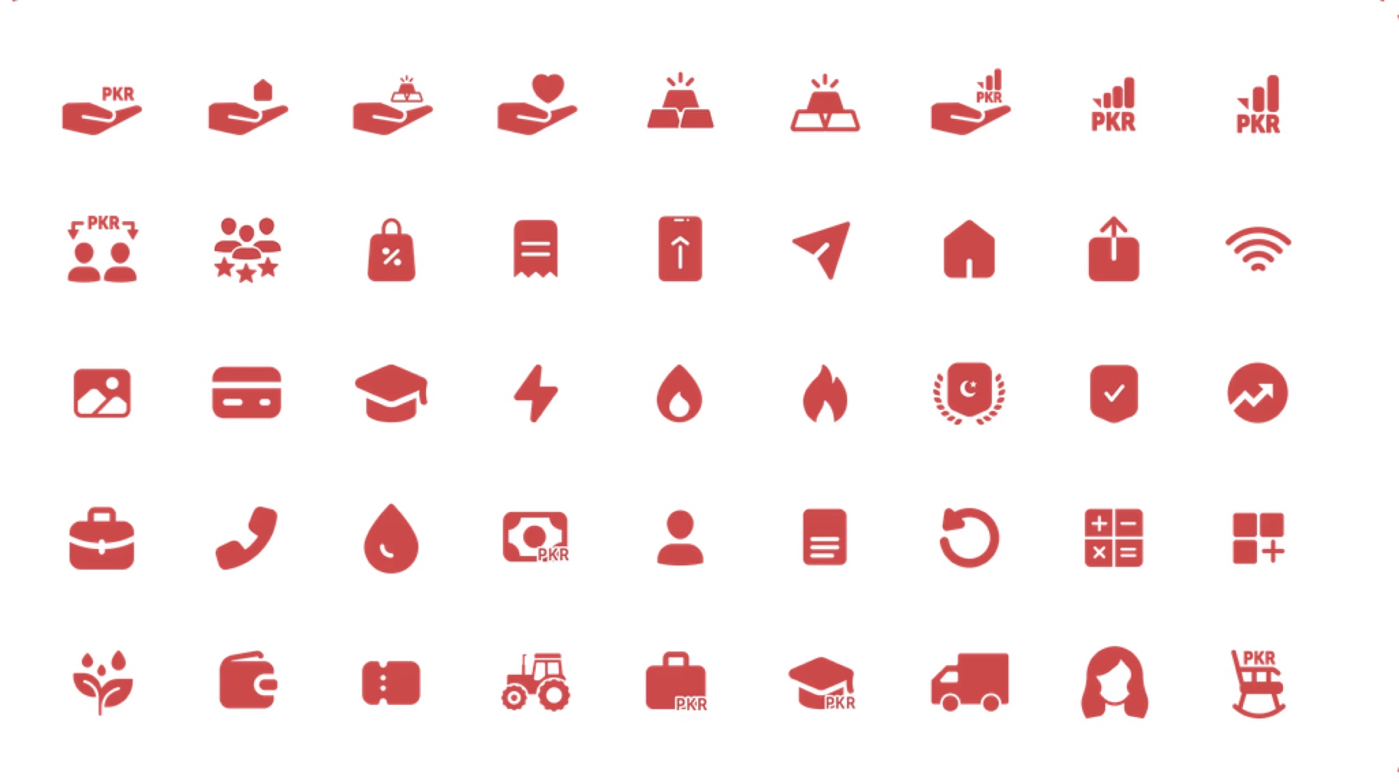
We chose legible over flashy
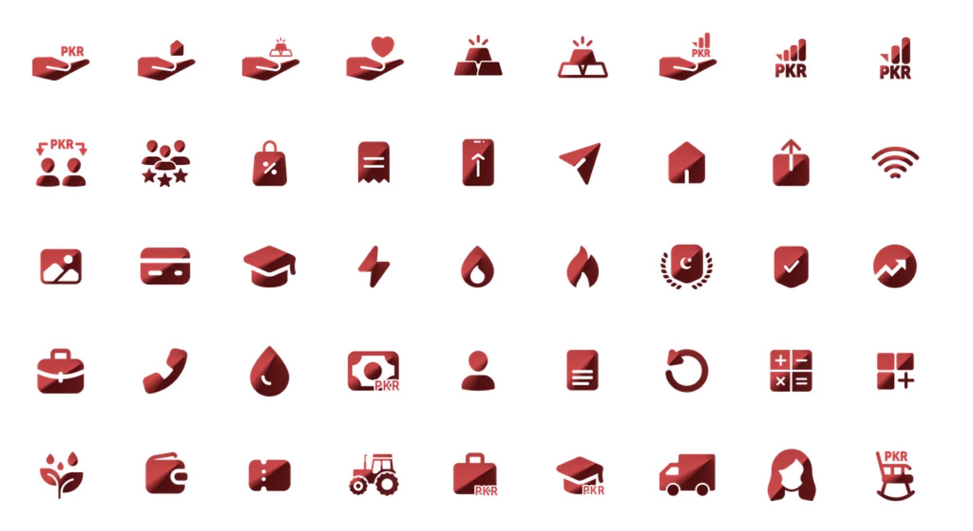
An early direction used gradient-filled icons: modern in a review, but muddy on the low-resolution, small screens most of these customers use. We moved to flat, high-contrast icons that hold up at small sizes and pass accessibility standards. Less flashy, far more usable.
Explored, not shipped
Shipped
Accessibility, proven
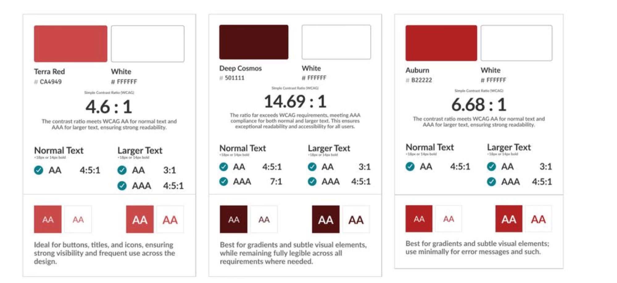
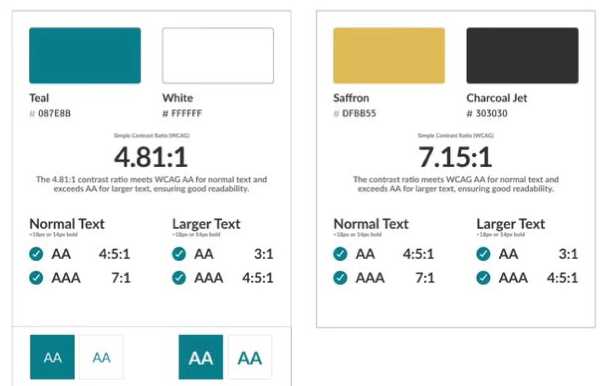
Accessibility was a constraint we tested against, not a checkbox after the fact. Every colour pairing was checked for WCAG contrast and assigned a role: high-contrast shades for text and buttons, softer hues for gradients and surfaces.
Terra Red
#C24D4D
Grounded and dependable, for financial confidence.
Auburn
#A02626
A bold, inviting red that encourages action.
Deep Cosmos
#5A1919
A warm brown-red adding depth and reliability.
Saffron Gold
#E6B93D
An optimistic gold for growth and success.
Tested in the field
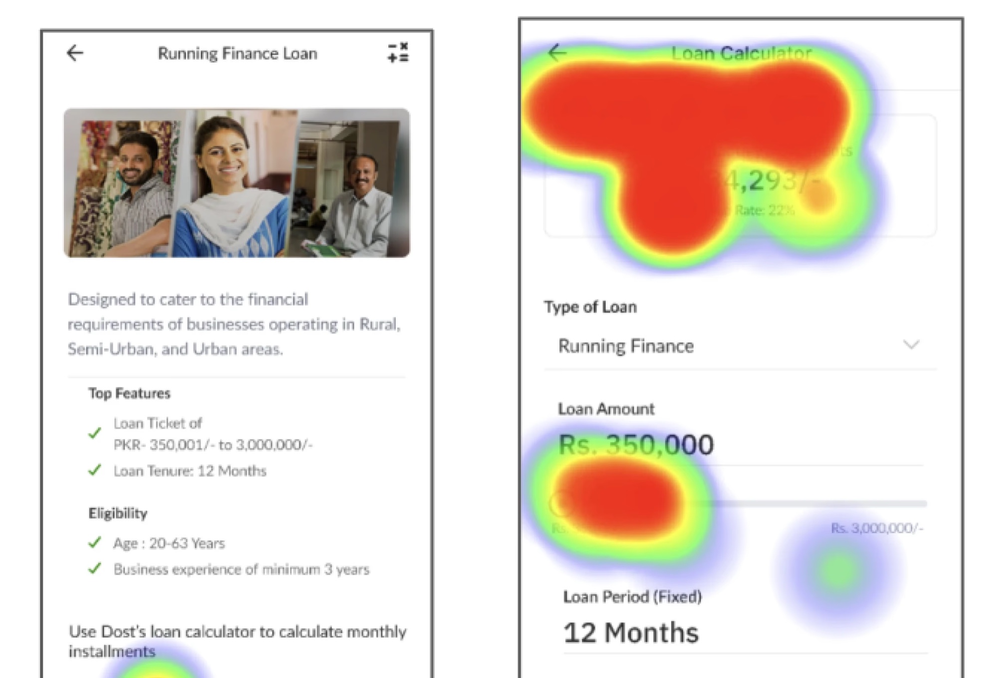
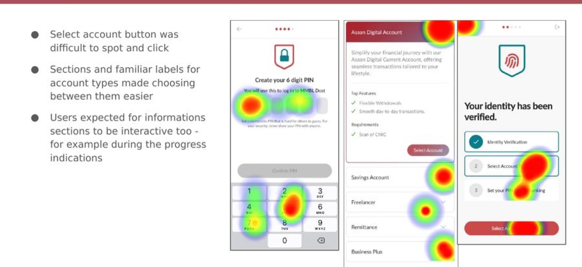
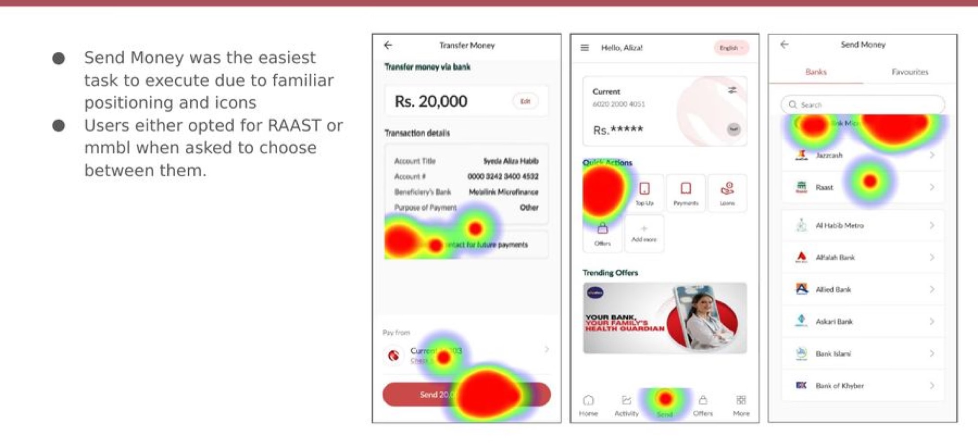
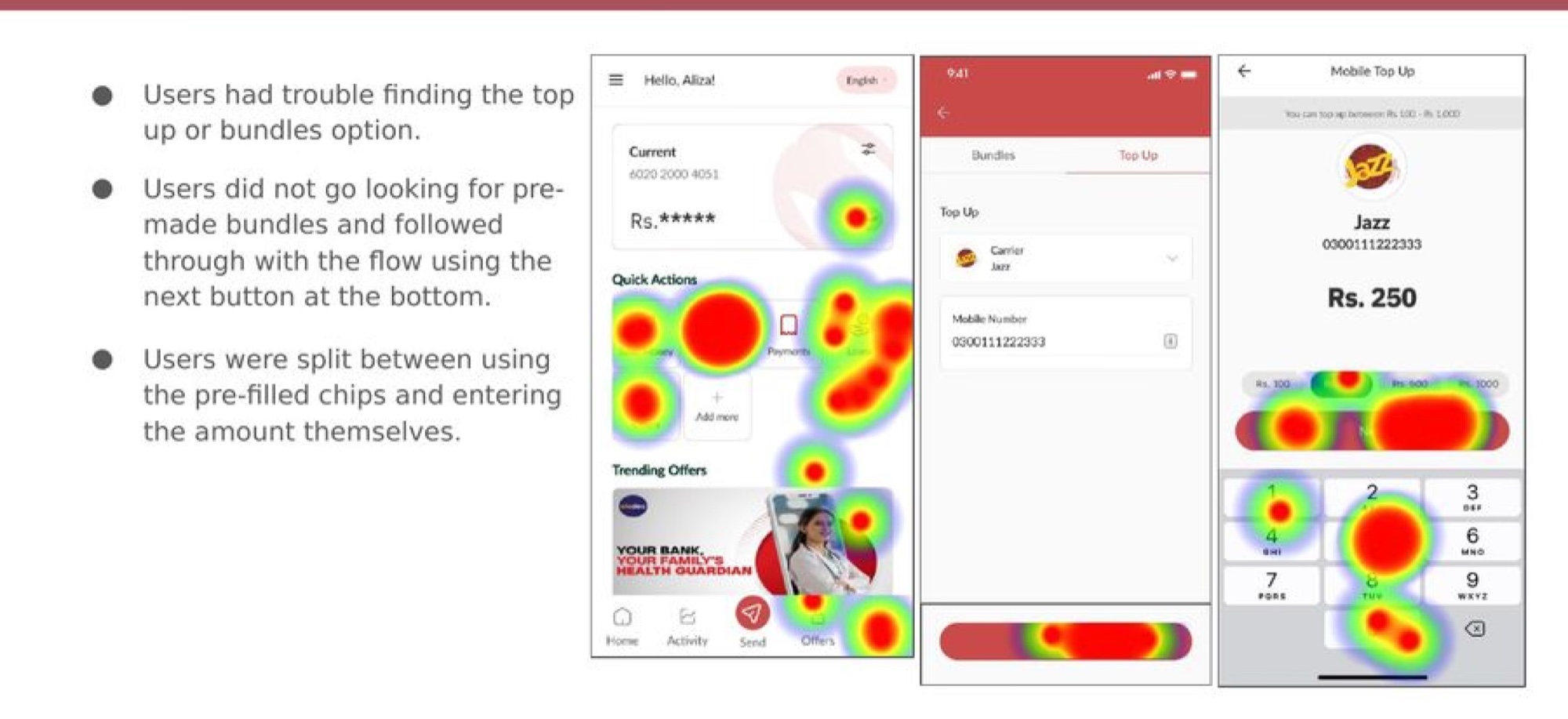
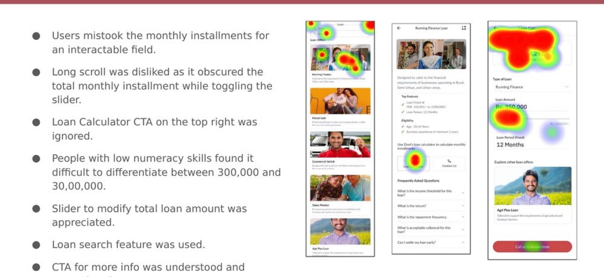
We ran moderated tests on the high-fidelity prototype in Maze with 10 users in Lahore, split across everyday-banking and loan customers. The heatmaps showed where attention landed and where it didn't, and confirmed which decisions were working before handoff.
Onboarding
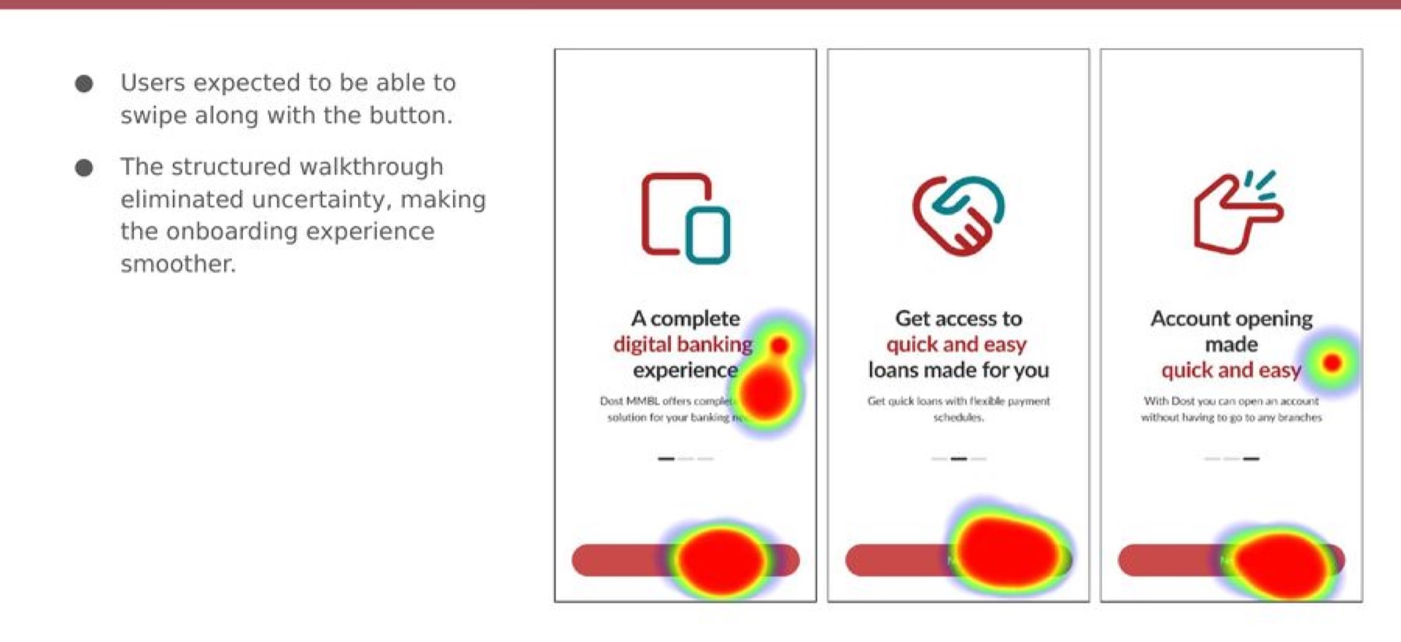
Account opening
Send money
Top up
Designing for low numeracy
Users with low numeracy couldn't reliably tell 300,000 from 30,00,000, and mistook the monthly installment for an editable field. Testing showed the long scroll hid the total while the slider moved, and the loan calculator CTA was ignored entirely. The fix: min and max bounds on the input, a read-only installment, comma-grouped digits, and a slider reworked to show the amount changing clearly.
Part Two: one app, two banks
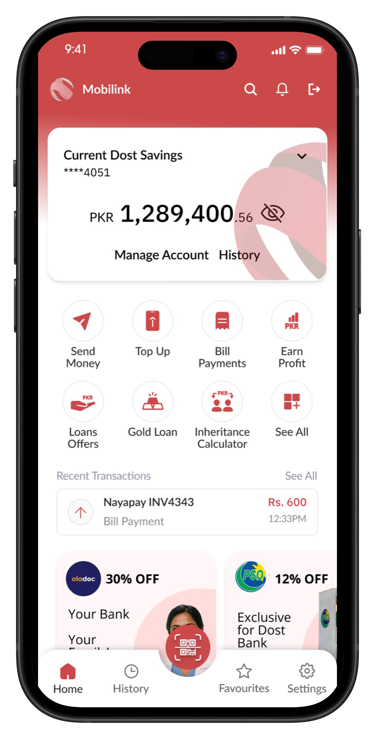
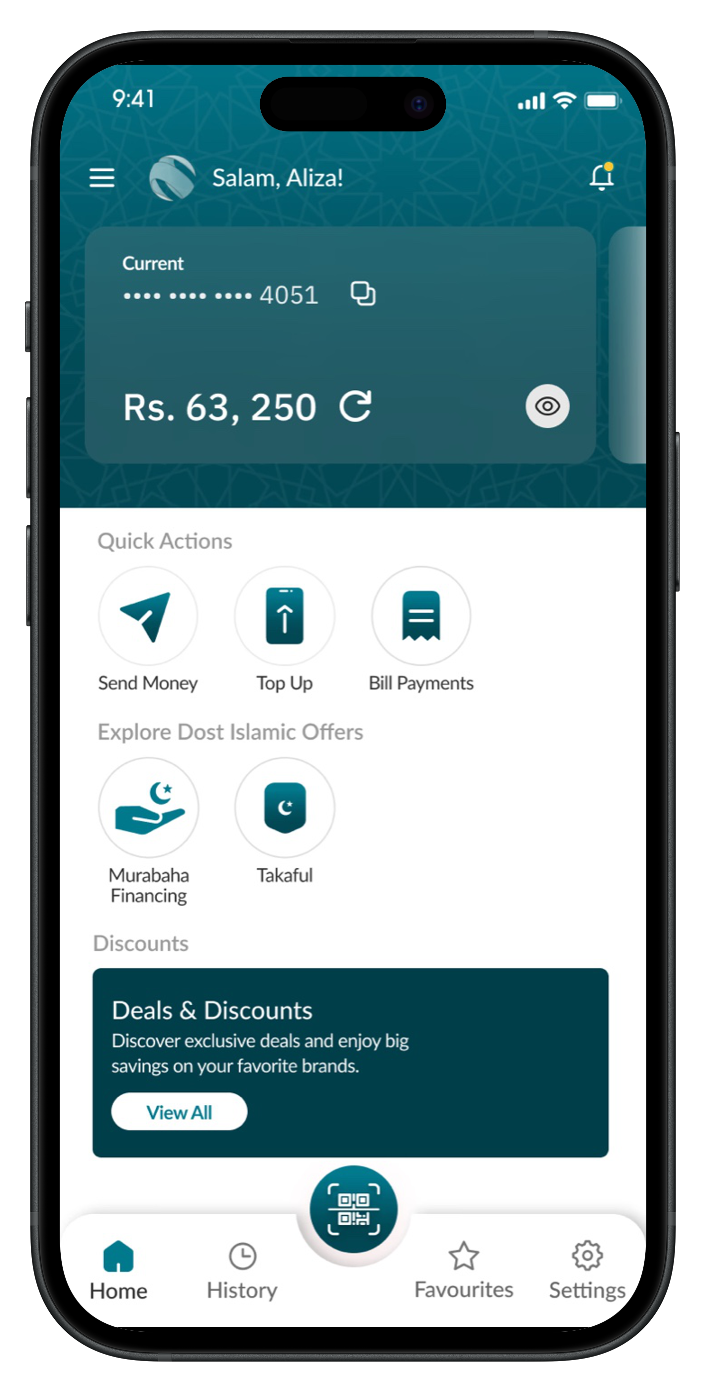
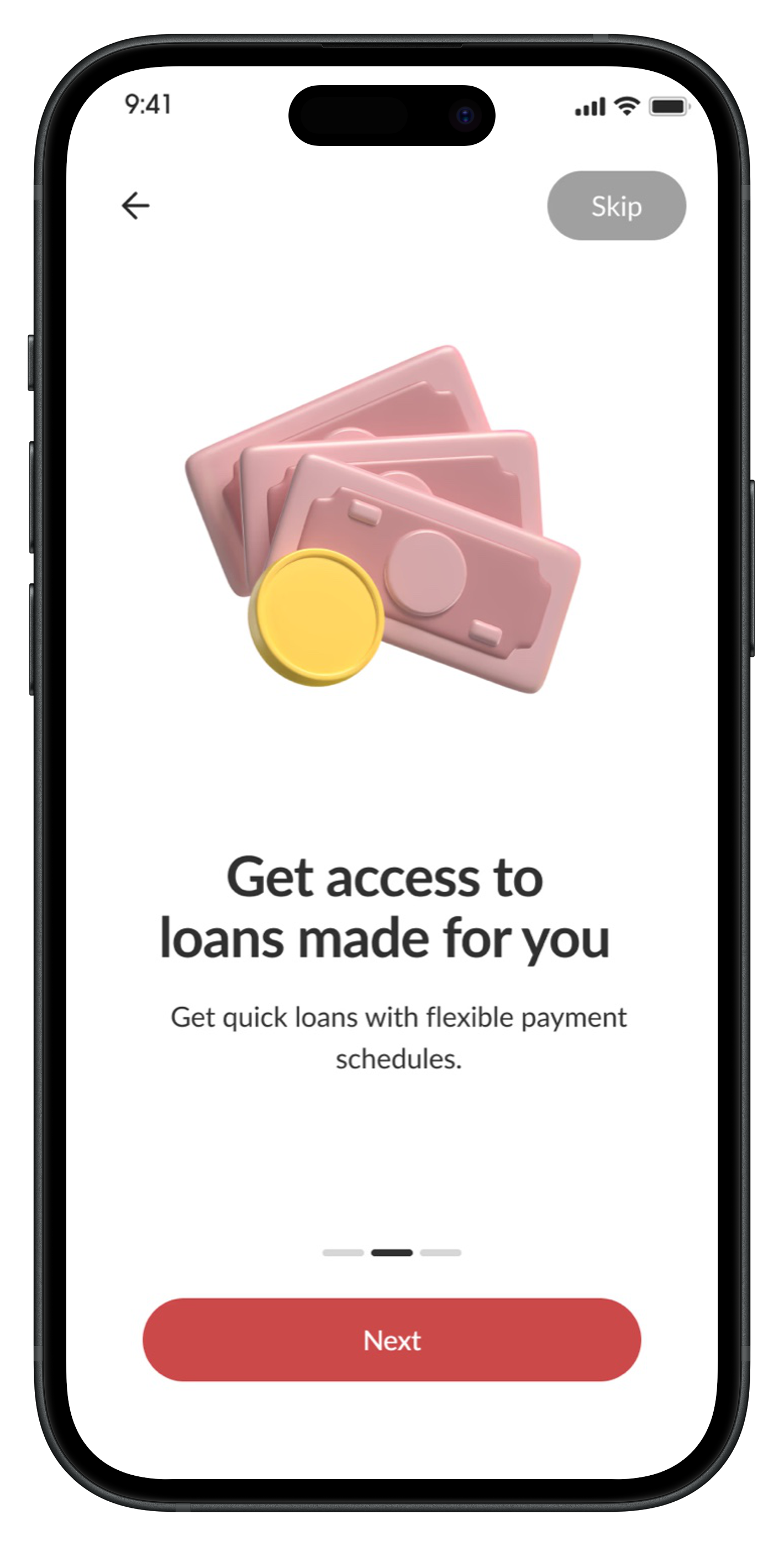
After the first release, MMBL brought us back. This time the ask was an Islamic banking experience inside the same app, for customers who bank according to Sharia. That isn't a skin over the conventional version. Interest can't just be renamed, the product set is different, and for many of these customers that difference is the whole reason they bank where they do. So the first question wasn't visual. It was how the app decides which version of itself to show: a splash-screen check routes each account before anything loads, conventional to red, Islamic to green, while customers with both accounts get a toggle and new users choose before sign-up.
Stayed the same
navigation & information architecture, the core flows (transfer, top-up, bills), the component library, and the patterns tested in phase one.
Changed on top
visual identity (red vs. green), the home screen & offerings, the product set, and the language around money.
Two identities, one journey
The same structure, the same journey, told in each customer's own terms.
Conventional
Islamic
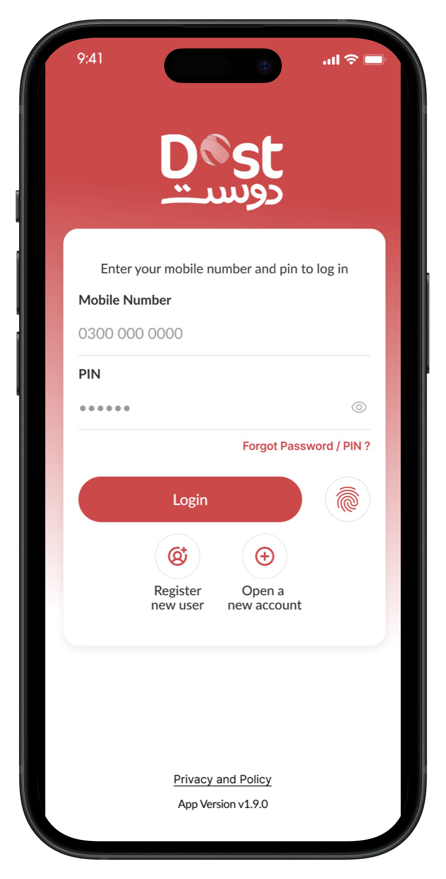
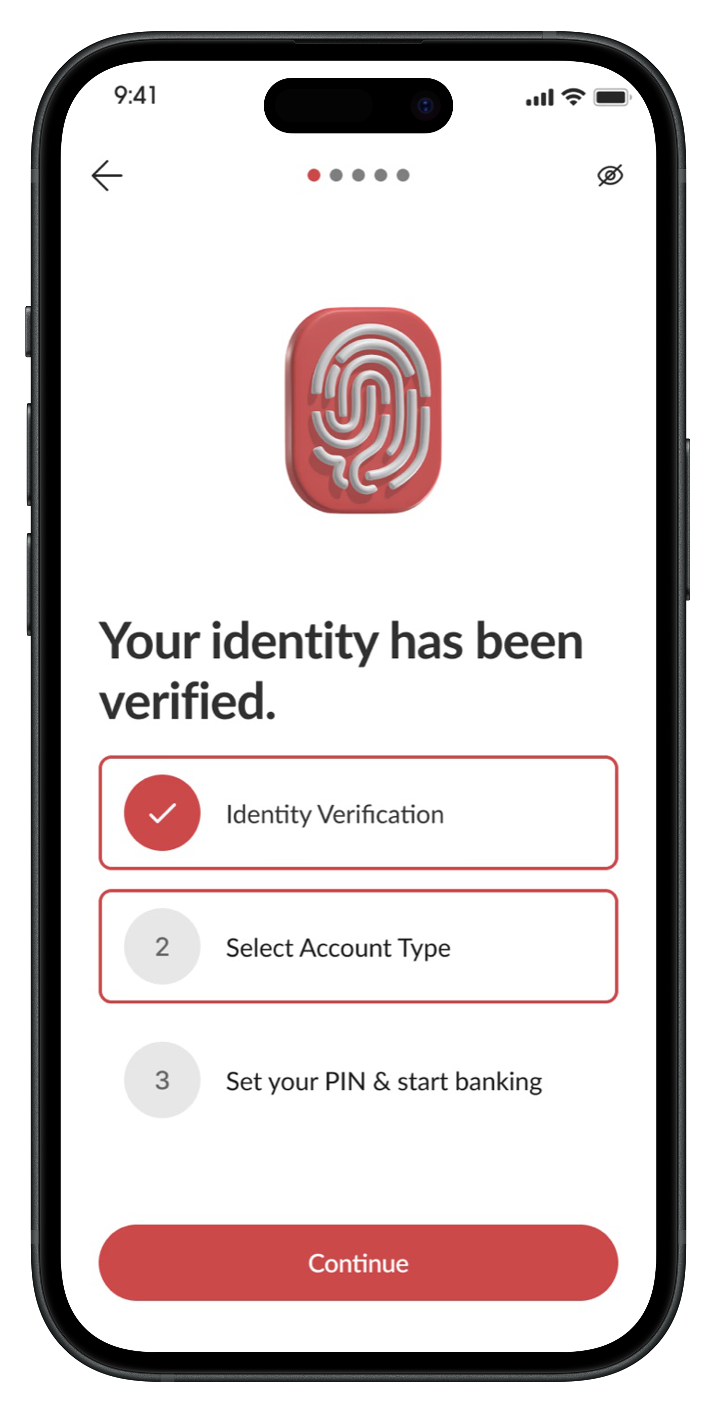
Onboarding, in each customer's terms
Conventional
Islamic
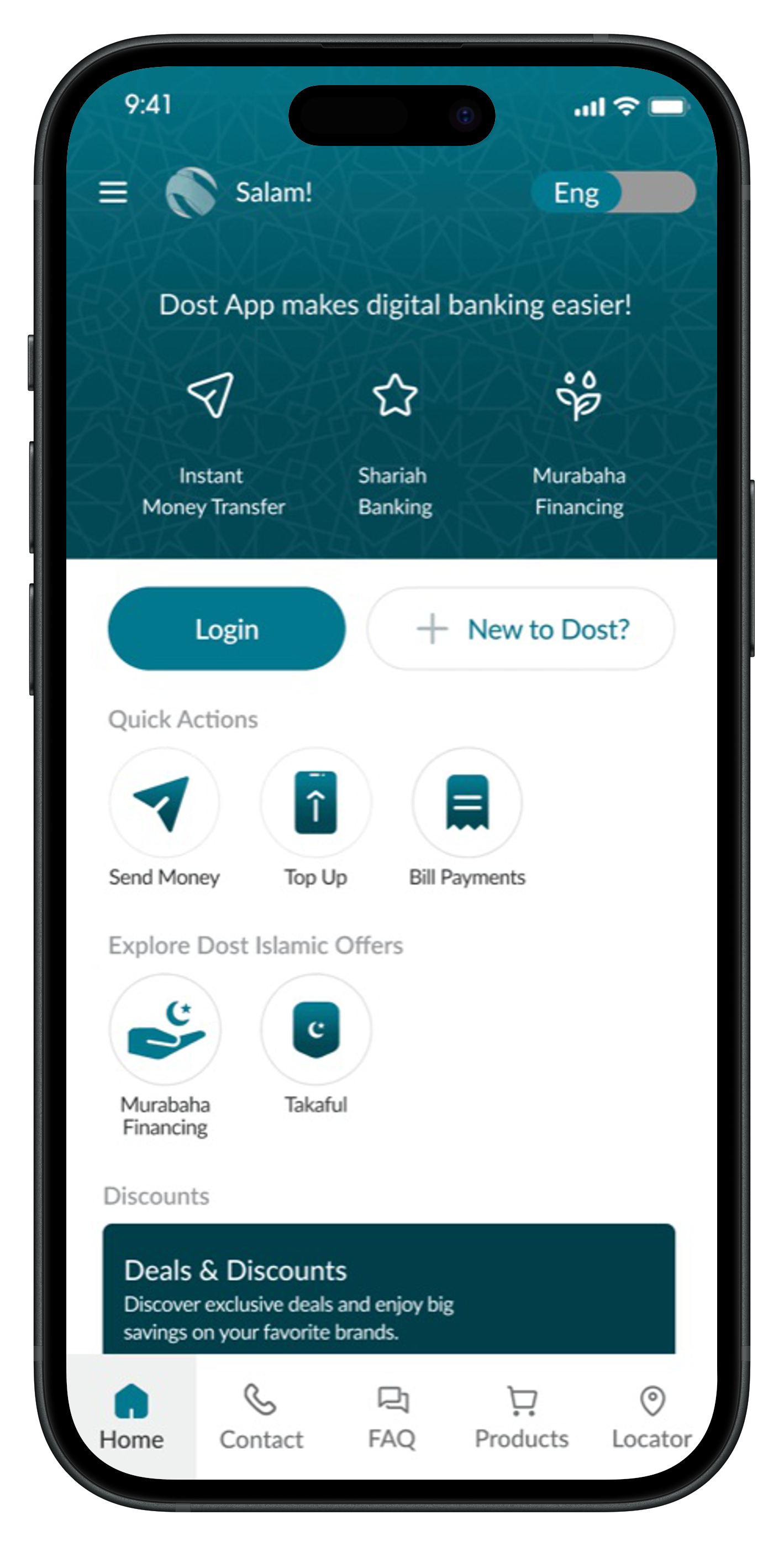
Real products, not relabelled ones
Someone opening the Islamic side should recognise it as theirs, not as the regular app with a different name.
The shipped app
We handed off a documented Figma file with the full design system, components, and styles, so the dev team could build it accurately. To close the project, I presented the recommendation report and findings to the CEO and senior leadership.
Outcome
A banking product that treats comprehension as a core design constraint, not an accessibility afterthought, built for the customer MMBL actually serves, across both conventional and Islamic banking, and grounded in research the team could point back to for every decision. After the work, MMBL saw a 64% drop in complaints about account opening.
64%
Fewer account-opening complaints
20+
Interviews
10
Moderated tests
More Work
02
HealthOps Reporting Dashboard
03
Flyve: Running for Everyone
04
Max: Gaming Community Platform
05
Maternal Health Supplement Research
06
National Family Health Brand Testing
07
Climate Finance Accelerator Launch
08
Impetus Advisory Group Website
09
What She Carried
10
Biofutures: Design Thinking for the Planet and Beyond
11
ToeTapText