02 · HealthOps (under NDA) × Ideate Innovation
HealthOps Reporting Dashboard
A planning platform where every report doesn't just show the numbers. It tells leadership what they mean, and stays current on its own.
- Sector
- Healthcare · Data viz · Reporting UX
- Role
- UI & Design Direction
- Type
- Planning platform · Data viz · Reporting UX
- Year
- 2025–2026
- Tools
- Figma
Delivered through Ideate Innovation for HealthOps under NDA. Product name (SystemSight) and screens are shown for portfolio purposes; all figures visible in the interface are placeholder or anonymised, not real client data.
Overview
HealthOps is a national healthcare planning platform. The screens here are a few of the views designed across it. The full system runs much wider, all built on one shared design system and handed off in Figma.
Jump to outcome ↓The Problem
HealthOps already had reports. Exports were accurate the day they ran and out of date soon after, and none of them got a planner closer to a decision. The job was to make the data explain itself: build screens someone who isn't an analyst can read at a glance, understand what's going on, and see what needs attention.
Exports were accurate the day they ran, and out of date by the time anyone read them.
Approach
- 01
Anchored the whole platform on one idea: show the number, then tell the reader what it means, and carried it through every screen.
- 02
Built four decision surfaces (executive outlook, access & wait times, report library, data quality) on a single design system, rebuilt from the client's real brand tokens in Figma.
01: Insights, not just the line
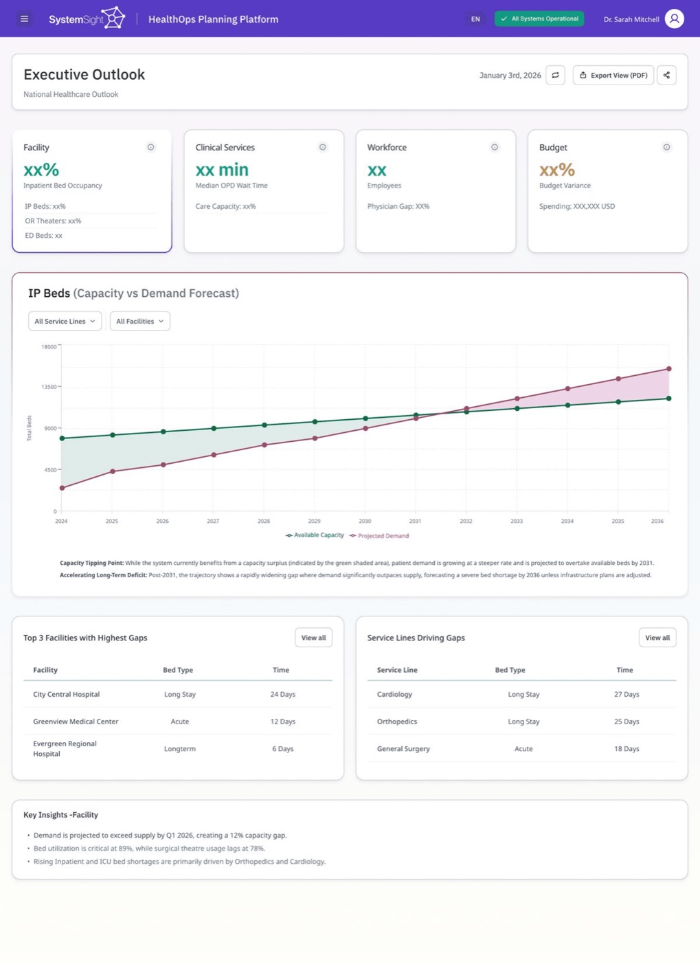
The Executive Outlook is a top-level read on whether the system can meet demand; from here the platform splits into four pillars: beds, workforce, clinical services, and budget. We led with a single interactive forecast chart instead of a grid of widgets, because that projection is what leadership needs before anything else. Colour-coded points, a defined stroke on the active item, and cards set one section apart from the next; the key insights below carry the rest of the story in plain language.
The forecast chart, front and centre.
Visibility of System StatusMarked points along the line signal hover detail.
Recognition Over RecallInsights written as conclusions, not chart labels.
Match Between System & Real World
02: Status language anyone can read
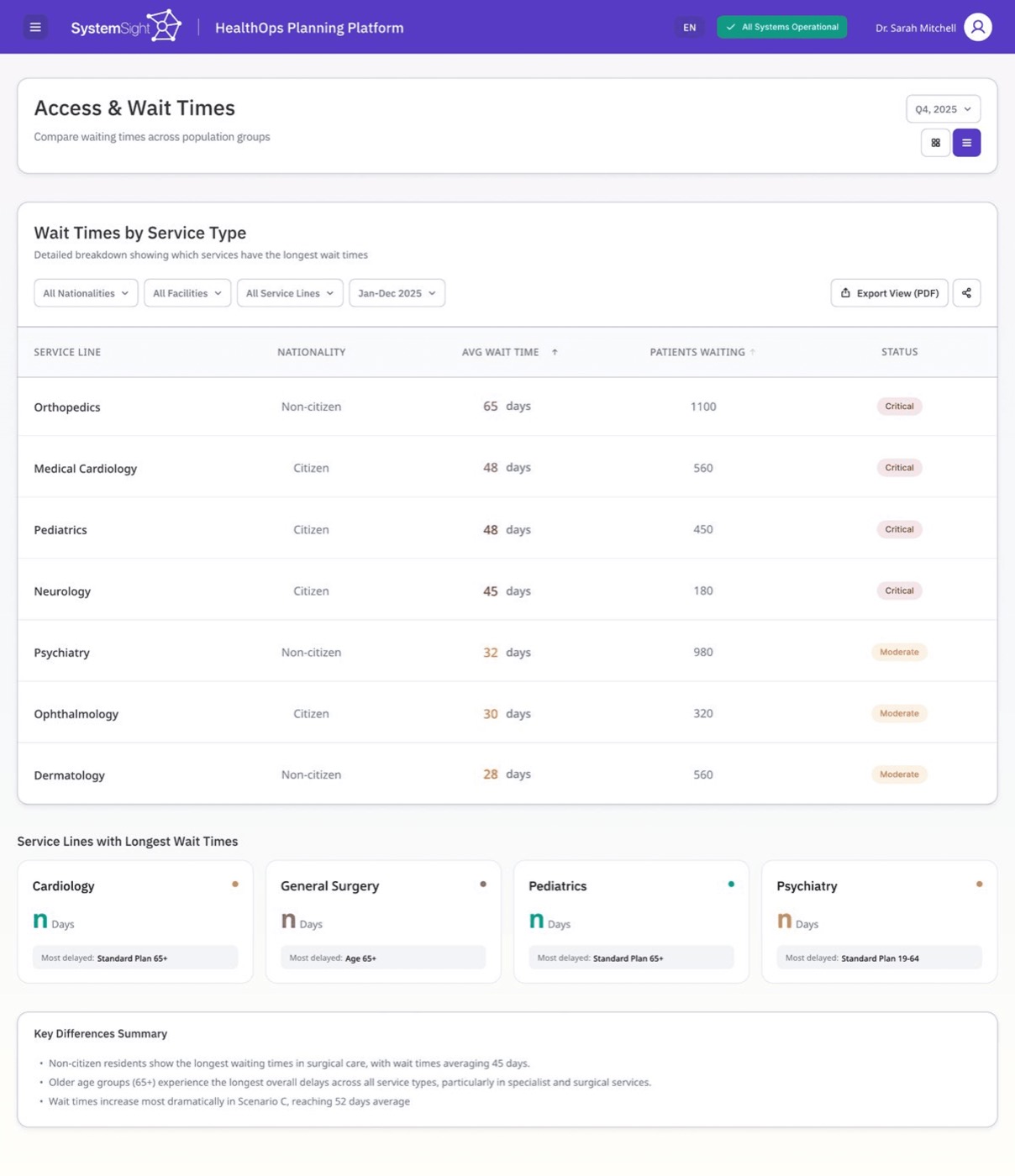
The Access & Wait Times screen shows how long patients wait across services and facilities; planners use it to decide where capacity needs to move, so the job is to surface the worst cases fast. We showed severity as colour rather than a number, so the critical rows register before you've read a value. The table sorts by longest waits by default, letting the order do the triage, and a short plain-language summary underneath names the pattern.
Longest waits sorted to the top.
Visibility of System StatusA colour-coded severity column.
Recognition Over RecallThe plain-language summary below.
Match Between System & Real World
03: Reports that stay alive
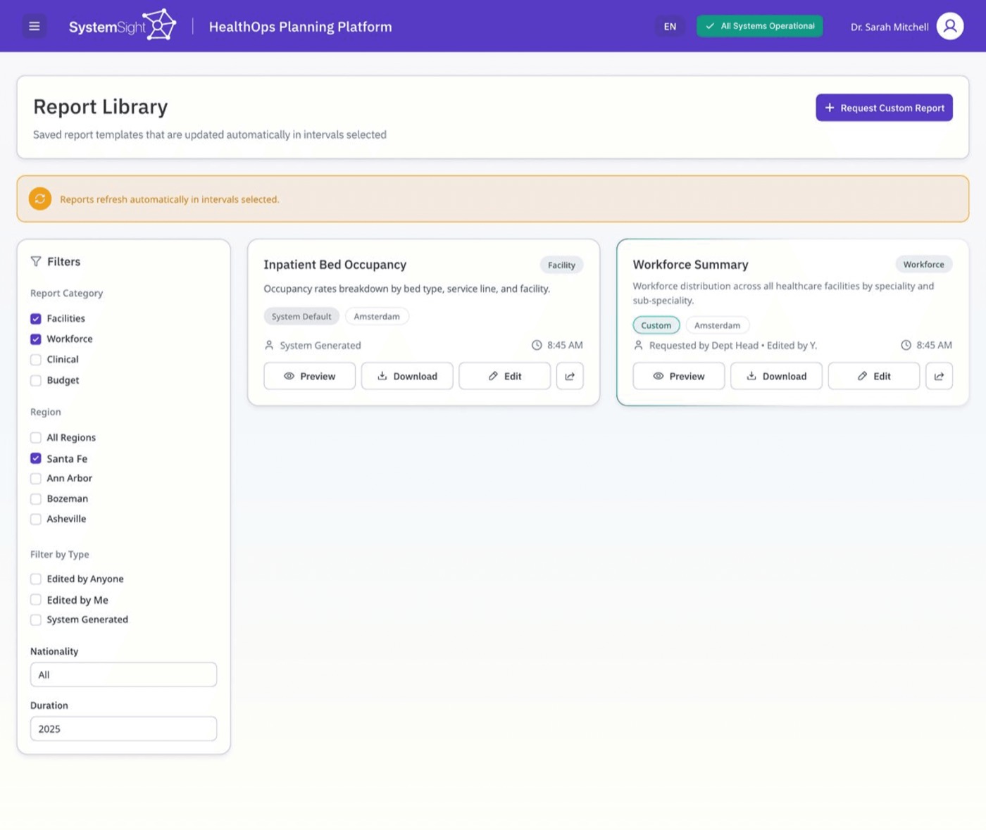
The Report Library is where teams keep the reports they rely on: the system's standard ones and their own custom requests. The risk with any reporting tool is that saved reports quietly go stale, so we set them to refresh on a schedule and kept that state visible. The data reads as current instead of something to double-check. System and custom reports look the same and sit on one shelf, so where a report came from never becomes a thing to think about; filters sit to the left, where scanning starts.
A visible refresh status indicator.
Visibility of System StatusSystem and custom reports on one shelf.
Consistency & StandardsFilters placed where scanning begins.
Match Between System & Real World
04: High-stakes data, organised for clarity
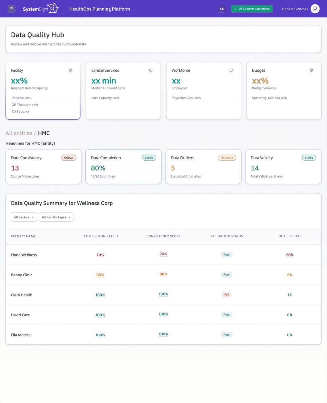
Every number in the platform depends on the data underneath it being clean. The Data Quality Hub is where teams catch mismatches and validation errors before they reach a report, so the screen carries a lot of dense information at once. We carried the same status language from the rest of the platform in, so nothing has to be relearned, and validation reads as pass or fail rather than a score to interpret. Each row resolves at a glance.
Consistent status badges.
Consistency & StandardsA pass / fail validation column.
Recognition Over Recall
Outcome
A platform that briefs its reader. The screens shown are a few of the views designed across a much wider system, all held together by the same move: show the number, then tell the reader what it means.
4
Decision surfaces designed
1
Shared design system
5+
Usability heuristics applied
More Work
03
Flyve: Running for Everyone
04
Max: Gaming Community Platform
05
Maternal Health Supplement Research
06
National Family Health Brand Testing
07
Climate Finance Accelerator Launch
08
Impetus Advisory Group Website

09
What She Carried
10
Biofutures: Design Thinking for the Planet and Beyond
11
ToeTapText
01
MMBL Dost App Redesign